A Mechanical Way to Pick Which Stocks to Wheel
20 July 2026 · 7 min read
Picking which stocks to wheel is usually a habit rather than a decision. You end up with the same handful of familiar large caps, typed from memory, because they feel safe. Making that selection mechanical means asking a different question — not "is this a good company?" but "does this name diversify the portfolio I already hold?" The genuinely useful part turned out to be discovering where the machine gets it wrong.
This is a build note on that work.
The list you already have is the constraint
My own candidate list was six defensive large caps. The same six, every time. The tool underneath was doing careful work allocating between them, but it could not tell me the obvious thing: that the list itself was the limiting factor.
That matters more than it sounds, because of what the rest of the book looks like. A portfolio concentrated in one area — for me, AI and semiconductors — does not get safer when you sell puts on more names that move with it. Every position added on a correlated name spends the same risk budget twice. The premium adds up on paper. The exposure does not work that way.
So the objective for a mechanical picker is not "find the fattest premium." It is: within a fixed crash budget, which names buy the most premium per unit of risk I do not already have? Those are different questions, and the second one has an answer you can compute.
Correlation, not category
The obvious way to measure diversification is to use sector or theme labels. It is also the wrong way. Those labels are editorial groupings — I write them myself — and they regularly put names in the same bucket that do not trade alike at all. A semiconductor-equipment maker and a defence-software company can share a theme and behave nothing like each other.
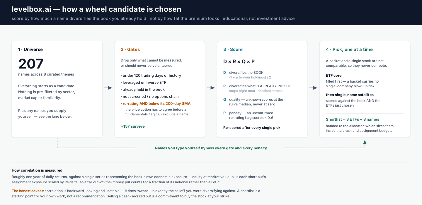
Realized correlation measures what the prices actually did. Roughly a year of daily returns, correlated against a single series representing the book's own economic exposure — equity at market value, plus each short put's assignment exposure scaled by its delta, so a far out-of-the-money put counts for a fraction of its notional rather than all of it.
The honest caveat: correlation is backward-looking and unstable. It rises toward 1 in exactly the selloff you were trying to diversify against — which somewhat defeats the purpose. Still better than a label, though.
The clone problem
The naive implementation ranks every candidate by correlation to your book and takes the top eight. That fails in a specific and slightly funny way: you can end up with eight names that are each beautifully uncorrelated to your portfolio and nearly identical to each other.
The fix is to pick one at a time and re-score after every pick, so each choice constrains the next. A name that would have ranked second gets demoted once its near-twin is already in the list.
It is worth saying that I nearly shipped a test for this that did not actually test it. The test passed whether or not the mechanism existed, because the data I had chosen made the right answer come out for the wrong reason. Rewriting it so it genuinely fails when the mechanism is removed took longer than writing the mechanism.
Baskets and single names are not comparable
An index or commodity ETF correlates with a lot of things by construction. Rank it on correlation alone against single stocks and a broad basket always looks mediocre — even though a basket carries no single-company blow-up risk at all.
So they compete in separate buckets: a small ETF "core" and a set of single-name "satellites", each with its own allocation. Correlation ranks within a bucket, never across — a basket never has to compete on a metric that does not apply to it.
What broke when it met a real portfolio
This is the part worth writing down, because every one of these passed the test suite and only surfaced when the thing ran against a real book.
A zero that meant "no data". The score multiplies a diversification term by a quality score. Twenty-two names in the universe carried a quality of exactly 0.00 — not because the businesses were bad, but because upstream financial fields were missing and the scoring lenses fell back to defaults. In a multiplicative score, zero is not a low value. It is an annihilator. Those names could never be picked, regardless of how well they diversified, and nothing in the output said so. They now resolve to the median of the names that do have data, and the output says explicitly when a number was imputed.
A label that fired on success. A "re-rating" flag, meant to catch deteriorating fundamentals, was excluding about 30% of the candidate universe. Checking those names against their own price action, only 17 of 62 were also below their 200-day average. The flag keys on revenue growth decelerating, which trips when a company goes from growing 50% to growing 31% — normalisation, not deterioration. Several flagged names were sitting within a few percent of 52-week highs. The flag now only excludes a name when the price action agrees; otherwise it just ranks it lower.
One young holding poisoning the whole measurement. The book contains a recently-listed name with about twenty days of history. Because the book's return series was truncated to its shortest constituent, that single small position collapsed the entire correlation window from 252 observations to 20 — and every correlation in the output was then computed on noise and printed to two decimal places. A 0.9% position silently invalidated the other 99%.
That last one is the one that bothers me most, because the output looked completely reasonable. There is no visible difference between a correlation computed on 252 days and one computed on 20. It just quietly stops meaning anything.
What the machine still cannot decide
Two things it cannot answer today, and it is better to name them than to paper over them.
It cannot tell you whether you are being paid enough. The premium-richness measure needs a few more weeks of volatility history before it means anything, so right now the ranking is about risk structure alone. A name that diversifies beautifully and pays nothing is not a trade.
And it cannot fix the data underneath it. Treating a missing quality score as "unknown" stops it from silently erasing a name — it does not conjure the financial data that was never there. That is a different, more boring project.
There is also a class of input it surfaces on purpose and refuses to score: what company insiders and a handful of well-known managers have been doing. That data moves on a horizon of quarters, which makes it fair for breaking a tie between two names that both survived the screen and useless as a reason to promote one that didn't. Folding it into the rank would give a slow signal a vote in a fast decision.
What it does now is narrower and more honest. It reads about 200 candidates, throws out the ones it genuinely cannot measure, and ranks what is left by how much each name reduces the concentration you already carry. It shows its working for every pick and hands you a list to argue with, not a decision. One name in my current output is flagged as deteriorating and still earns its place, because it is negatively correlated to everything else I hold. Whether that trade is worth making is not the tool's call.
The pattern across all three failures is the same. None of them were wrong numbers — they were invisible ones: a name quietly unrankable, a window quietly too short, a flag quietly excluding a third of the field. Nothing threw an error. It all looked fine.
If you take one thing from this into your own process: when something gets excluded, make it say so out loud. The candidates you never see are the ones you cannot check.
This is analysis tooling, not advice. A shortlist is a starting point for your own work — selling a cash-secured put is a commitment to buy the stock at your strike, and no ranking changes that. Related reading: why a cheap price is not a margin of safety on reading a business's trajectory, and wheeling in toppy and bottomy markets on adjusting to the regime you are actually in.
Common questions
- How do you pick which stocks to wheel?
- Most people pick from habit — the same handful of familiar large caps, every time. A mechanical approach starts from a different question: not 'is this a good name?' but 'does this name diversify the portfolio I already hold?' You measure that with realized correlation from about a year of daily returns, weighted by your actual economic exposure, then rank candidates by how much they reduce the concentration you already carry. Premium matters, but it is the second question, not the first.
- Why measure correlation instead of using sectors or themes?
- Sector and theme labels are editorial groupings, and they routinely put names together that do not trade alike. Two stocks can sit in the same 'AI' bucket and have very different return patterns, while a stock and a commodity ETF in completely different buckets can hedge each other well. Realized correlation measures what the prices actually did rather than what the label says they are. It is not a forecast — correlation is unstable and changes in a crash — but it is a measurement rather than an assumption.
- Can a screener decide which stocks to wheel for you?
- No, and the interesting part of building one is discovering exactly where it stops being useful. A screener can rank candidates by how much they diversify your book, filter names it cannot measure, and show its working. It cannot tell you whether you want to own the business, whether the premium compensates you for the risk, or whether a label it generated is actually true. In testing, one internal flag fired on around 30% of the universe and price disagreed with it about two-thirds of the time. The output is a shortlist to review, not a decision.
- What is the biggest risk in a mechanically-selected wheel candidate?
- That the machine is confidently wrong in a way you cannot see. A score that looks precise can be built on missing data, a stale label, or too few observations. The specific failures worth guarding against are silent ones: a name that is quietly unrankable because a field was empty, a correlation computed over twenty days instead of two hundred, or a flag that excludes a third of your candidates on a signal the price action contradicts. Assignment risk does not go away because a number looked tidy.
Read next
- Technical Thoughts
Why a Poor Man's Covered Call Cannot Be a Runner
A poor man's covered call looks like cheap stock exposure with income on top. The arithmetic says the short call has to be sold close enough to cap you, because below about 0.20 delta it stops covering the long leg's decay.
- Technical Thoughts
More Delta Means More Yield, and More Risk. How We Found a Middle Ground
Selling deeper puts pays more premium and carries more risk. Choosing what delta to sell came down to targeting a chance of assignment rather than a delta label, plus explicit rules for which companies may carry it.
- Technical Thoughts
Your Option Book Is a Knapsack Problem (The Hard Kind)
Allocating capital across option positions makes portfolio optimization a knapsack problem, of the multi-dimensional, integer, class-constrained kind that has no efficient exact solution. Here is what our optimizer gives up to answer it anyway.